Menu Close

Tag: concept art

Forest / Desert Environment Concept Talk!

Hello blog friends! It’s been a while! Real life has been crazy, but we’ve been chugging along on the game! [EDIT: holy heck, this post has been sitting in drafts for like, a month! I completely forgot to post it, aaa] Last time I posted, I wrapped up on talking about the starter Phantoms in the game. Now it’s time to talk about where all of the Phantoms, NPCs, and the Player live–the different worlds and environments.

I’m going to let you in on a secret πŸ‘€: I don’t particularly like doing environment stuff. Yep, crazy. My drawing passions lie with character and creature design, not quite UI and backgrounds. However! I do really like learning about new things and drawing inspiration from places I’d never thought to look before. So, I spent a lot of time looking at architecture from all over the world and used my newfound love of houseplants to fuel my sketching! (I have… too many houseplants for someone who just got into the hobby a few months ago πŸ˜…)

The Forest 🌳

You’ve seen the forest a lot, and you’ve probably even seen the concept art I’ve done for it in Claire’s posts! But I’m going to touch on it briefly just because it was the first environment we figured out and the first one that the player will see upon entering the game.
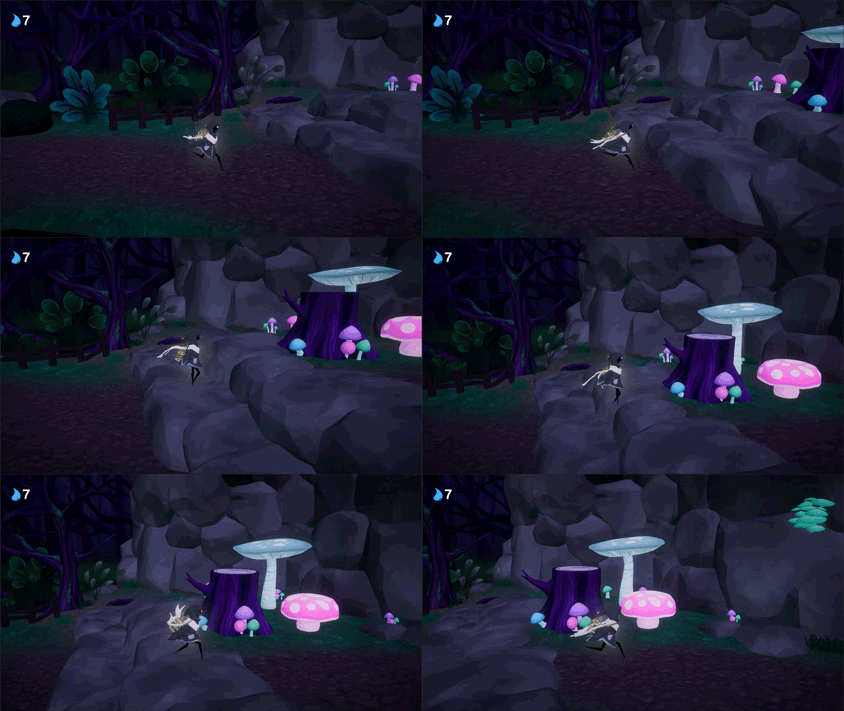
So, this is what the forest looks like in-game at the moment! A lot of darker colors, with a few pops of bright colors with the mushrooms. I did all of the textures for the trees and ground that you’re seeing here, with no bump mapping, if you know what that means! Basically, it just means that I painted them completely flat, with no computer magic to create actual 3-dimensionality in the game! Just good old-fashioned shadows and highlights πŸ˜‰

We used a lot of purples and dark greens, with a fairly strong blue tone over both. Cooler colors feel naturally a little less cozy and, well, warm than warm tones! We wanted to get a somewhat creepy vibes without making everything too dark to read.
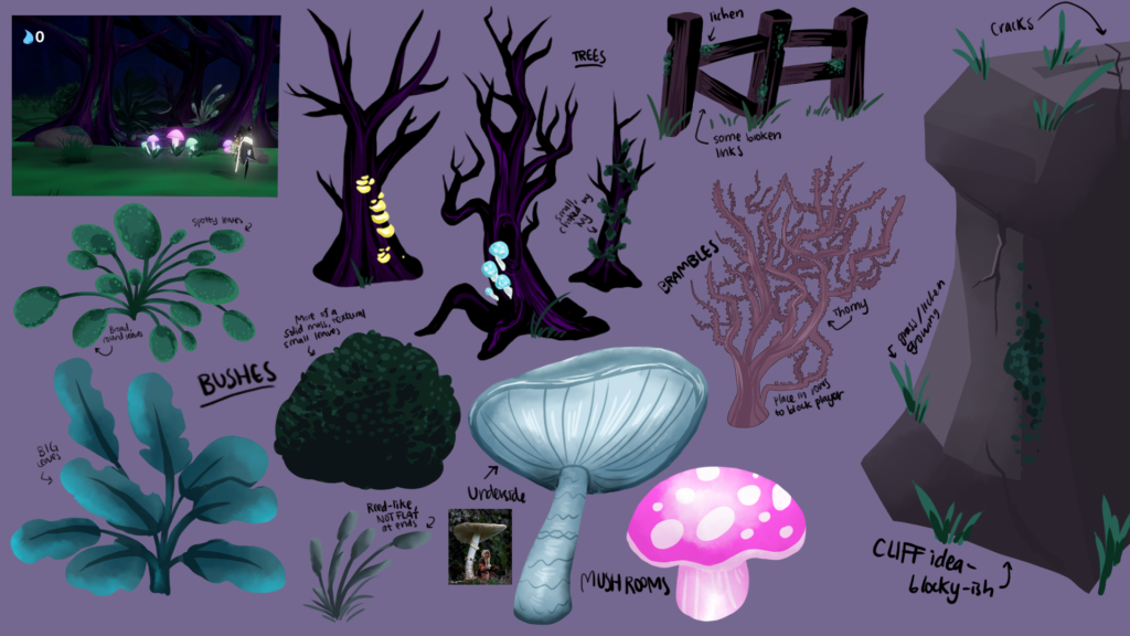
And here’s the concept sheet I did for some props for the area! Some big mushrooms to platform on, some greenery to fill in the forested parts you can’t get to, and more!

The Desert 🌡

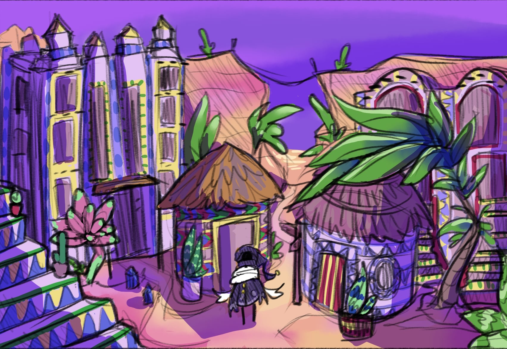
This is the hub world of the game! The second place the player will visit! There was some apprehension about the idea of a desert world in the game, since the deserts in many other games are pretty… barren. Monochromatic. But I think there’s a lot of room for color and beauty in a big sandy expanse too! My favorite biome in Minecraft is the painted desert, so it kinda influenced a lot of my colors choices here πŸ˜…

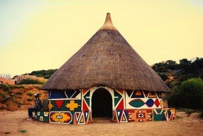
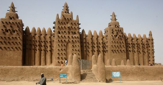
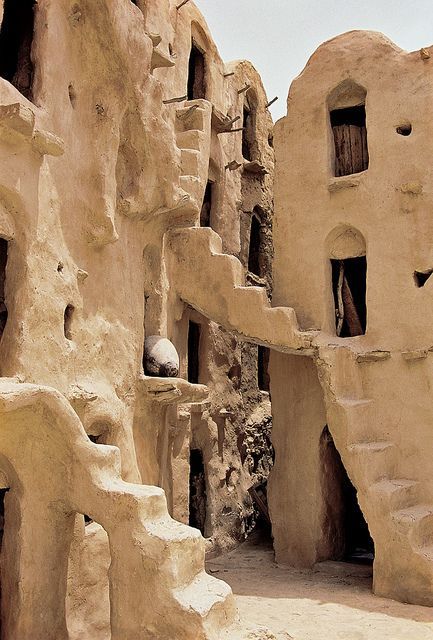
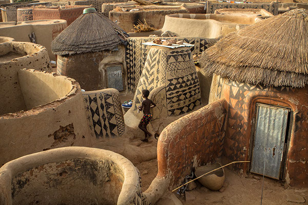
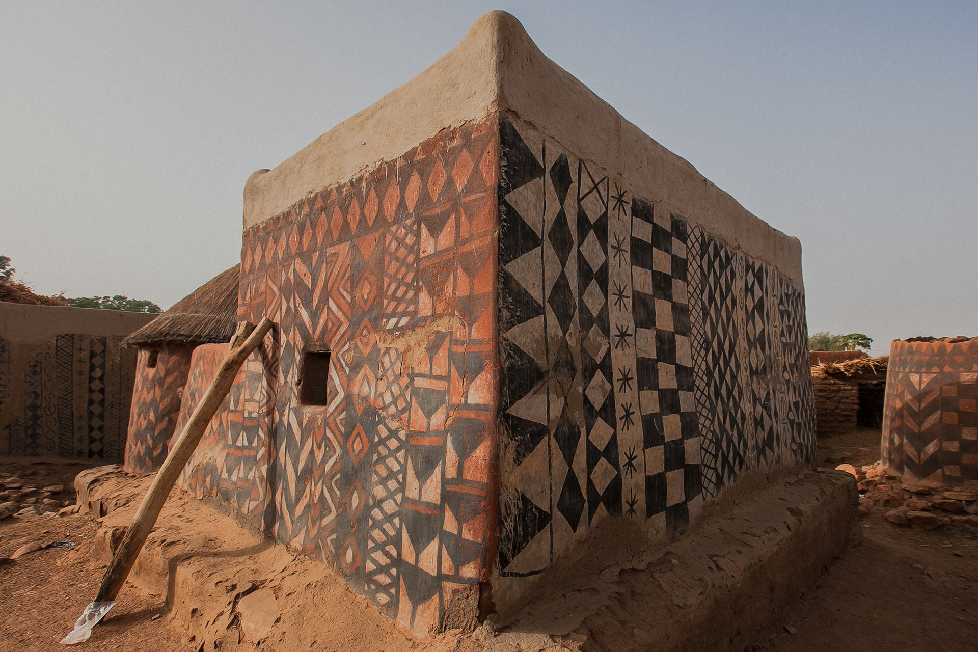
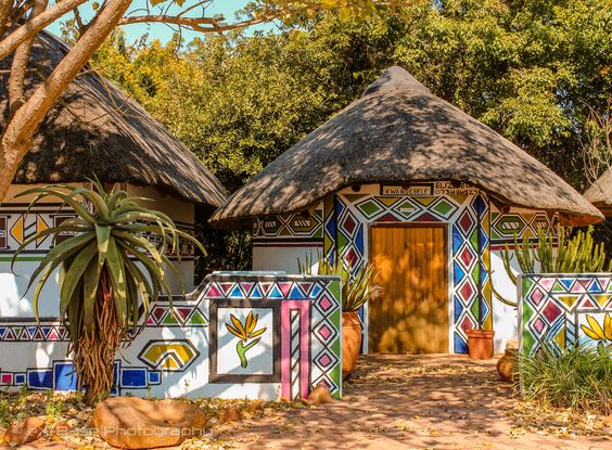
This is my colored sketch for the environment. A lot of larger than life succulents, painted terracotta and clay buildings, and color! Lots of color. I referenced a lot of African architecture (among others, the painted village of TiΓ©bΓ©lΓ© in Burkina Faso, Ndebele house painting, and the traditional architecture of Morocco and Mali), plus a few references from India and… the Tatooine set from Star Wars. The stairs are cool, okay?

Some of the images I used as reference/inspiration are below!

I’m pretty… wary of borrowing inspiration from cultures I don’t know personally, so I tried to be respectful about my approach. I won’t be using any specific buildings as a mold for ones in the game, and I’m making an effort to establish my own set of rules for patterns and color palette in this area. This isn’t just for aesthetics, but so that I don’t accidentally grab parts of the culture that hold significance that I’ve missed. By the way, if there’s ever any part of these blog posts or art that I’ve done for the game that you think isn’t culturally sensitive, please message me or comment! I want to include influences from various cultures within my art, and I do research on all of it, but I’ve only been deeply entrenched in the cultures I grew up in myself so I’m bound to miss certain nuances.

In Conclusion

Anyways! I have 2 more environments to share in a future blog post, so look forward to that! Until then, stay cool, make good choices, and… uhh… don’t do drugs ok bye!!

Final Starters – Shame and Calm!
Hello world! It’s ya girl, Sera, back at it again in the devblog! …anyways.

Today’s post is about the final 2 starters that I haven’t talked about yet: shame and calm! Now! I didn’t leave these ones till the end for any reason in particular, so don’t get your hopes up too high πŸ˜… But I do think these designs came out pretty rad, and I hope everyone else does too!

Shame Starter 😷

Now this one was, surprisingly, a big favorite among people who playtested our Phantom starter quiz a while back! I didn’t expect Shame to be such a hit (my favorite is still Anger!), but a lot of people really like them for some reason!

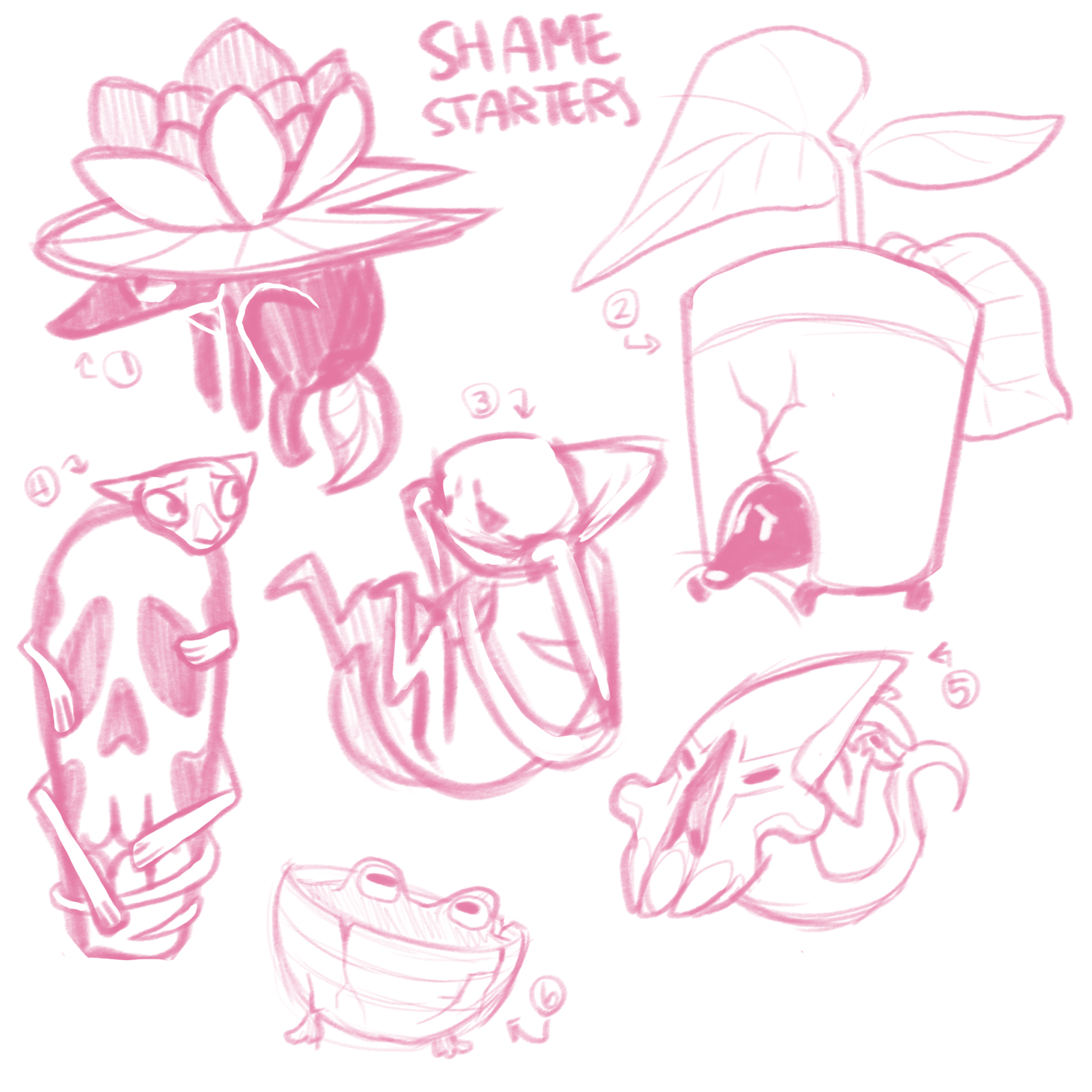
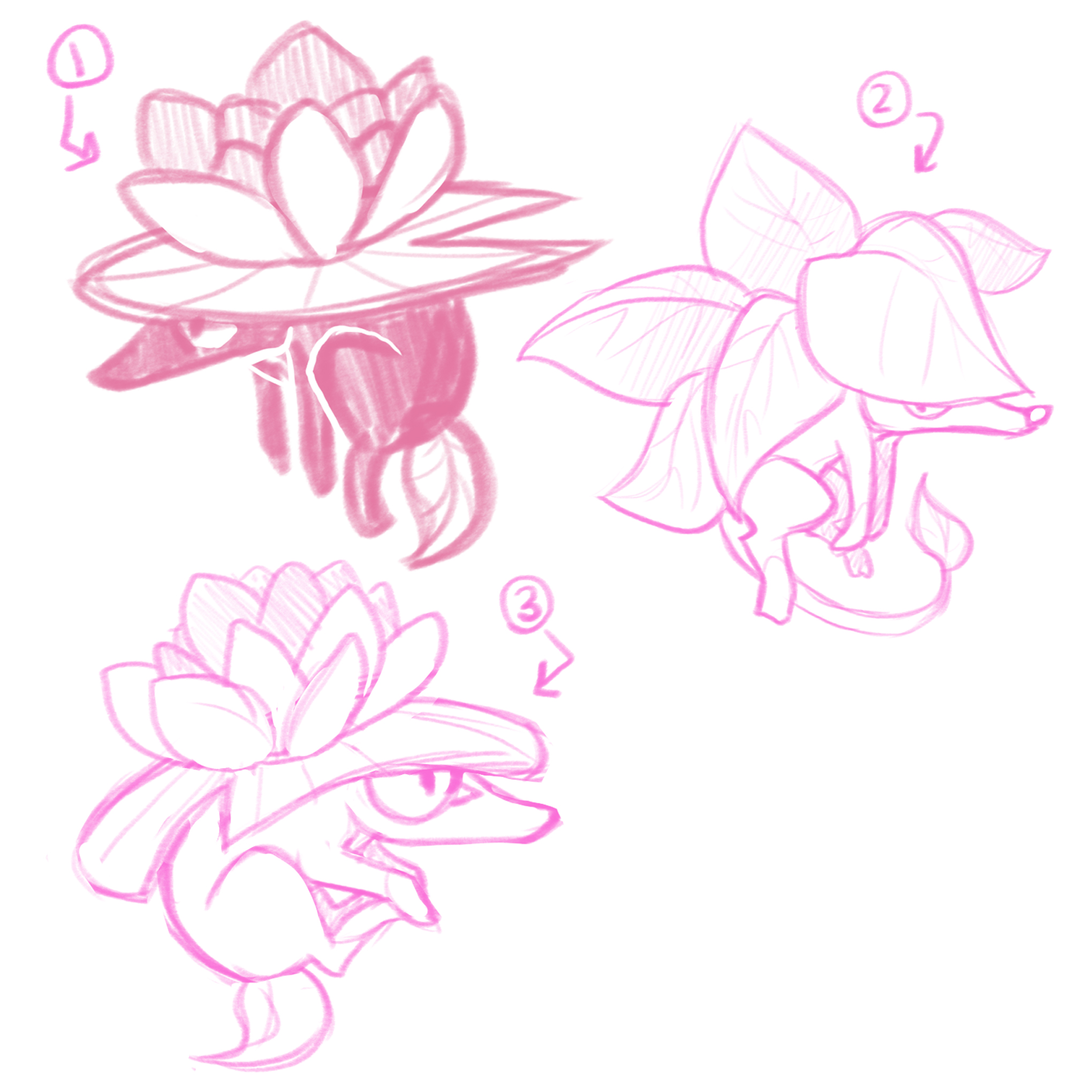
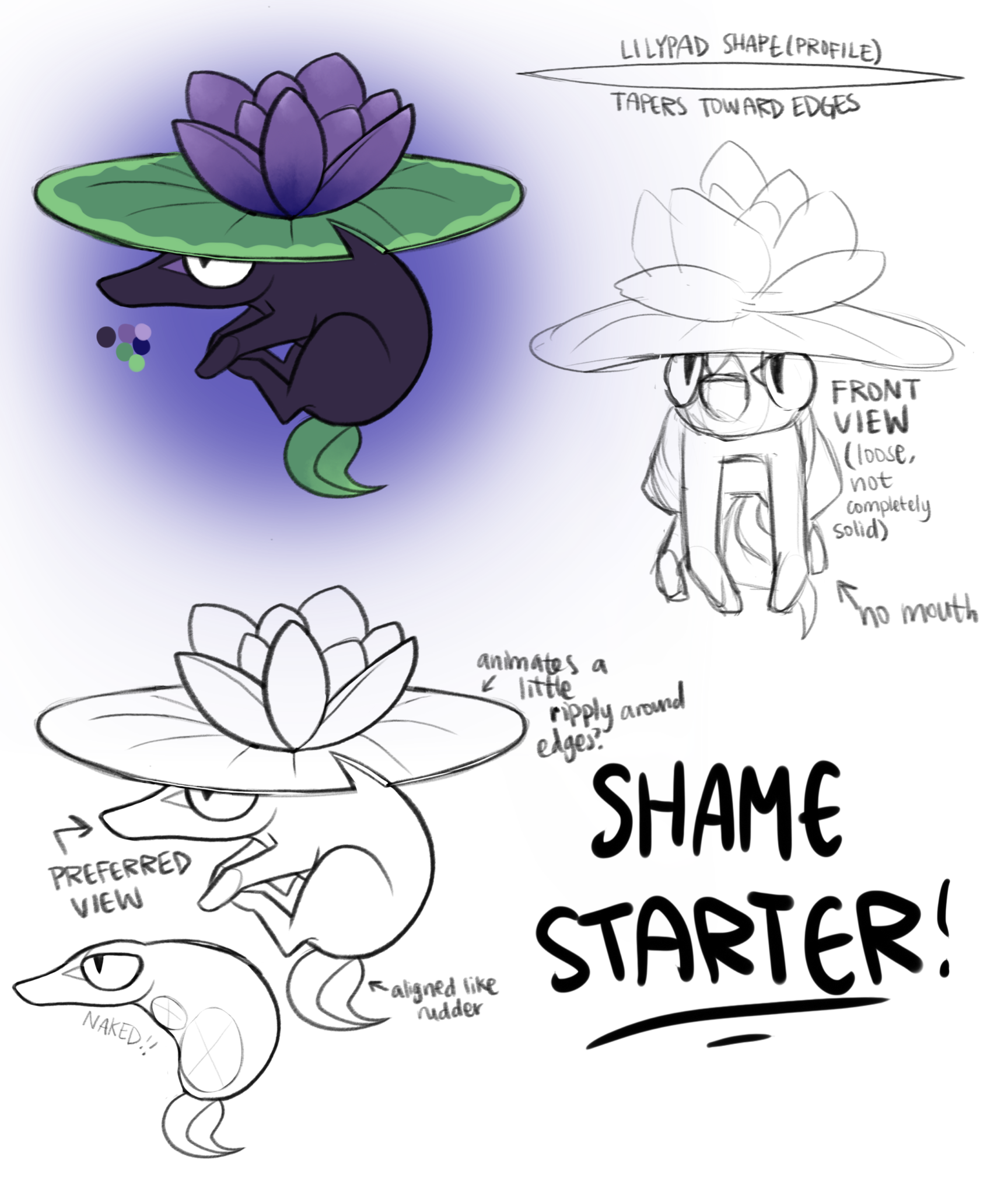
Their design process was rather short, with the final design being pretty much the same as one in the first round of rough sketches!

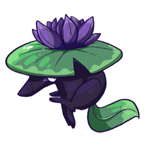
The idea of designing something around the concept of shame is a weird one, and a lot of my ideas revolved around the actual creature hiding either in or behind something. The one we ended up going with is probably the least extreme use of that idea, just sorta chilling underneath a lilypad. The Shame starter is extremely loosely based on a Japanese yokai, the kappa! Very loosely. Pretty much the only thing they have in common is a tendency to hide underwater and some kind of plant-y camouflage on their heads! I’ll probably make another Phantom more based on kappas so I can talk about them some other time πŸ™‚

The Shame starter ended up much more shrew-like than anything, and I think people ended up liking them because they’re just a bit sassier than a lot of the other starters!

Calm Starter 😌

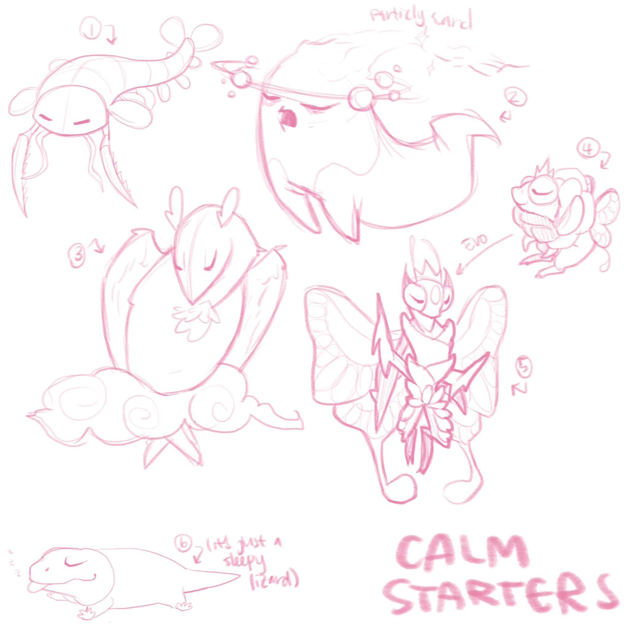
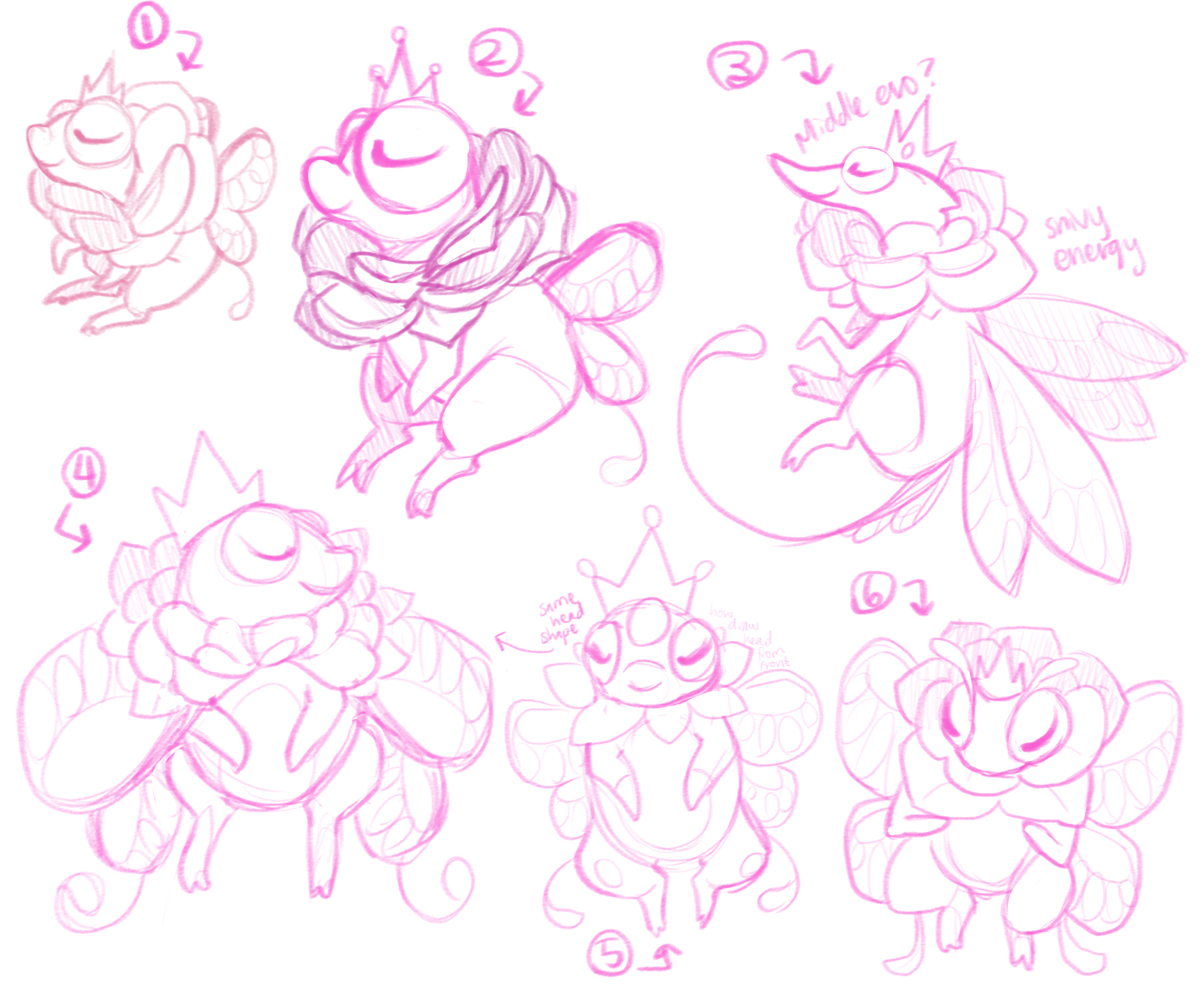
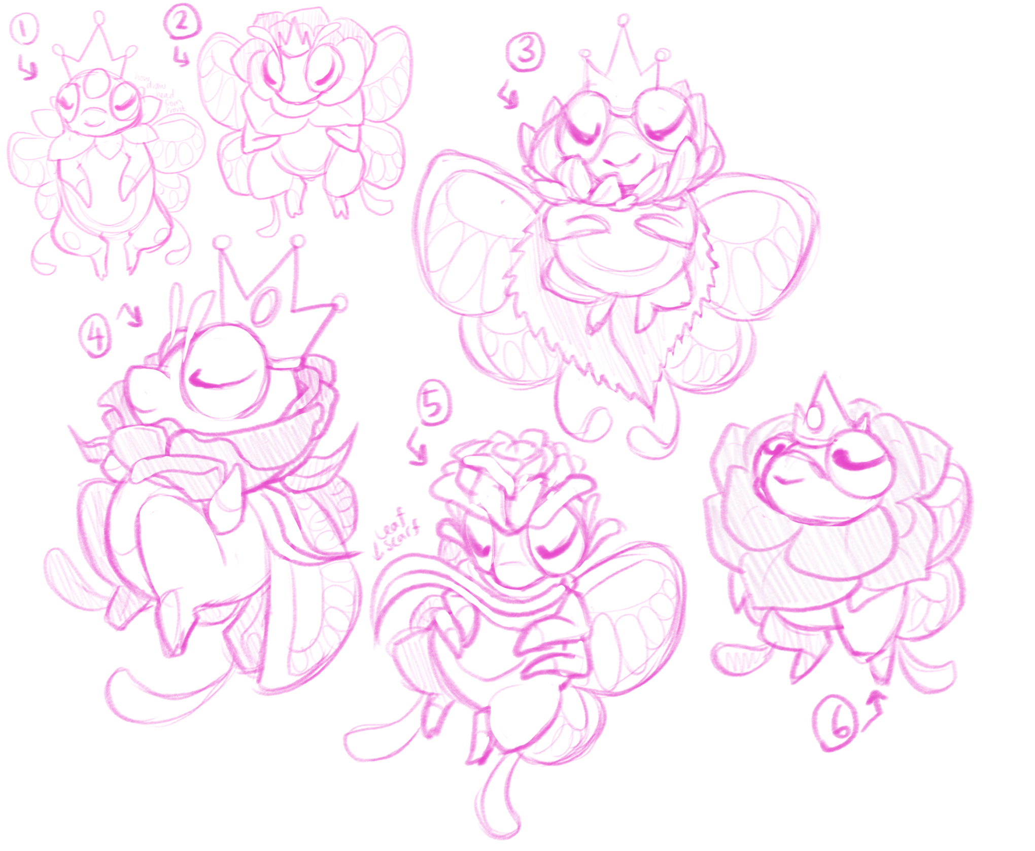
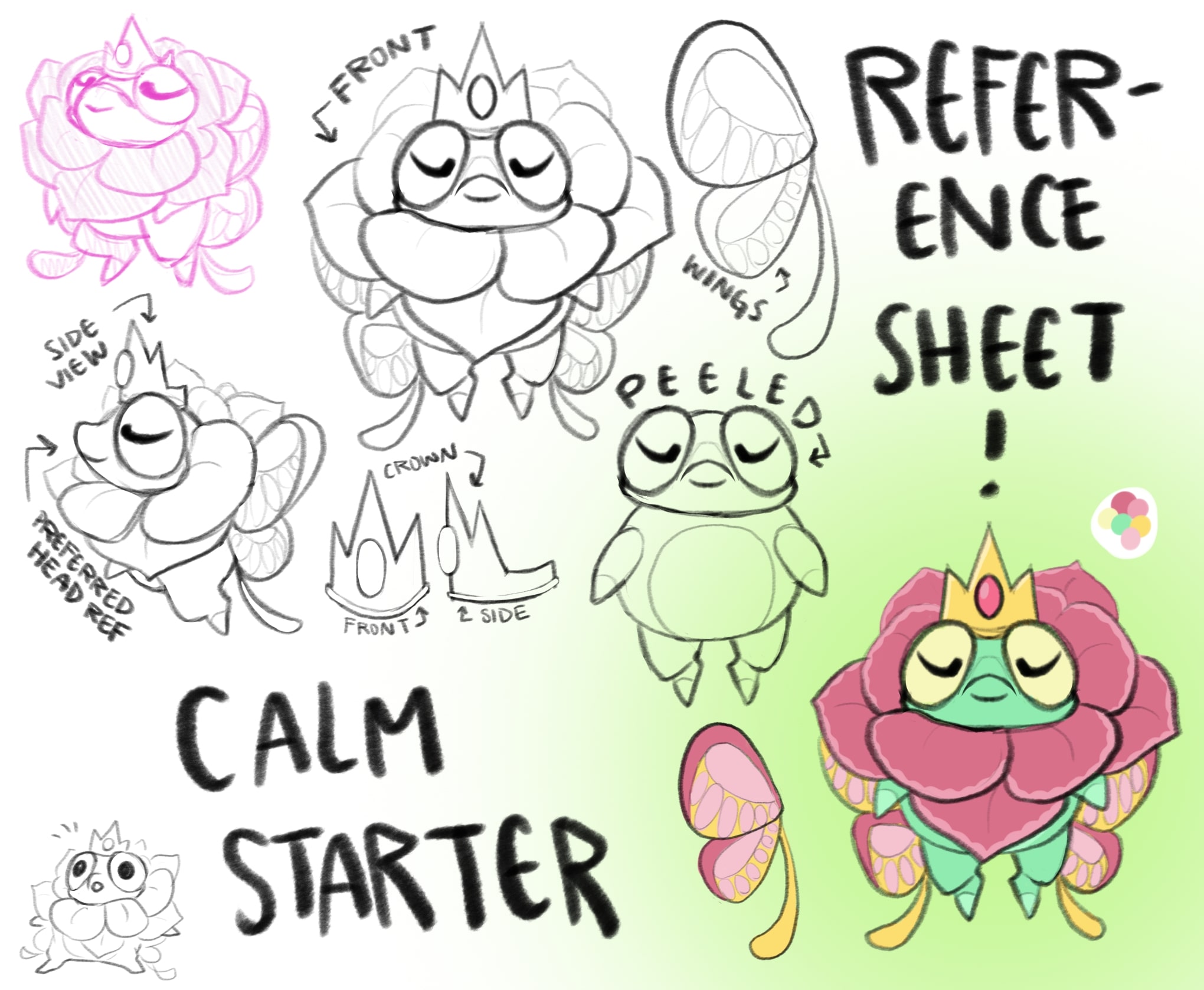
The Calm starter! They had to go through a lot of adjustment to get some proportions exactly how we wanted, but ended but fairly close to one of the first designs (that seems to be a trend πŸ€”).

The first idea I went to when thinking about “Calm” as a principle emotion for a character to have was to make them sleepy! But other than that… I didn’t have a lot of ideas for shapes, or much inspiration for somewhere to start! One of the Phantoms in the first round (number 2) is based on Sandman, and I still really like the design! But it felt a little too on the nose looking like a ghost for a starter.

So! The idea we ended up going with is based on fae in general, but a bit more on the ones in A Midsummer Night’s Dream, solely based on the idea of royalty and a fae court. A lot of people seemed to think this Phantom was kinda froggish, but my intention was to make them more bug-like… πŸ˜“ I see where the confusion comes from, though.

So! Flowers, royalty, bugginess, butterflies, that’s a lot of ideas to pack into one design! I think we did a decent job, but they do end up being the most complicated-looking Phantom! I think that’s ok πŸ™‚ One of the notes we got from playtesters was that this Phantom gave them a smug vibe, which was unintentional, but I like it 😈 I’m always extremely down to make Phantoms that aren’t all sunshine and rainbows!

You may have also noticed that some of the my reference sheets include a sketch labeled either “peeled” or “naked”… That’s not just me being weird! It’s so Claire has a better reference when she starts modeling the Phantom πŸ˜…

Conclusion

Soo, yeah! That wraps up all of the starter Phantoms! I still have plenty more to talk about, though! I’ve done more NPCs, environments, and Phantoms so I still have loads to rant about! Thanks for sticking with me and reading my blog posts! I really do appreciate it, and I enjoy writing these! If you have any questions at all, please feel free to either comment or join our Discord!

Oh! And you probably already know this if you’ve been reading Claire and CJ’s own posts, but we’ve been working on some business stuff, and I did a few cleaned up little drawings of our starters for that, so I’ll leave off with those! πŸ‘‹

Love and Fear Starters

Heya! Sera here! Devblog time!

So! Today I’m going to be chatting about the Love starter and Fear starter! By the way, the order in which I talk about the starters is somewhat random and mostly just based on what I feel like writing about on any particular day πŸ˜… Here we go!

Love Starter πŸ’–

The Love starter! There were a lot of directions to go, but we kind of knew from the start that at least one of our starters was going to be based on a dolphin. One of our friends from college has always wanted a dolphin Pokemon, and has yet to be granted that wish, so this one’s for her!

I looked into some cryptids that were dolphin-like, and most of them were pretty boring to be honest. A lot of globsters (animal carcasses that wash up on beaches and are misidentified as monsters, extinct animals, etc), and just not a lot of particularly original creatures. Which is to be expected when looking up a monster based on what it probably is in real life! But I did find one that gave me at least a bit of a starting point for our design: the rhinoceros dolphin.

The rhinoceros dolphin supposedly was spotted in 1820 off the coast of the Sandwich Islands and New South Wales, and was described as a large dolphin (around 9 feet long), with a black and white splotchy patterned skin and two dorsal fins. The men who originally spotted this “species”, Jean Rene Constant Quoy (who was a zoologist and anatomist) and Joseph Paul Gaimard (a naturalist) claimed to have spotted a whole pod of them, about 9 in total. No known cetacean has two dorsal fins (they all either have one or none at all), and despite a few more sightings of dolphins with two dorsal fins over the years, the rhinoceros dolphin is thought to be an old classic–misidentification!

There are a few explanations for what Quoy and Gaimard saw that day: a dolphin with a remora stuck on its head, a dolphin exhibiting “somersault” behavior (lying on its side with a flipper and fluke out of the water), or a pod of inbred beaked whales with some genetic mutations among them. I personally believe that the most likely explanation is a pair of beaked whales that appeared as one creature because of perspective! Baby dolphins sticking closely to their mothers’ side is a commonly observed behavior, and could easily explain the strange placement of a second dorsal fin on the animal’s head!

Our dolphin Phantom takes a lot of inspiration from this cryptid! I incorporated the two dorsal fins, since those are the most obvious feature of the original rhinoceros dolphins, and converted the big black and white splotches into little heart shaped ones! I also took the liberty of giving our Love starter a more obvious reference to the cryptid’s name with a little rhino horn on its snout.

Fear Starter 😱

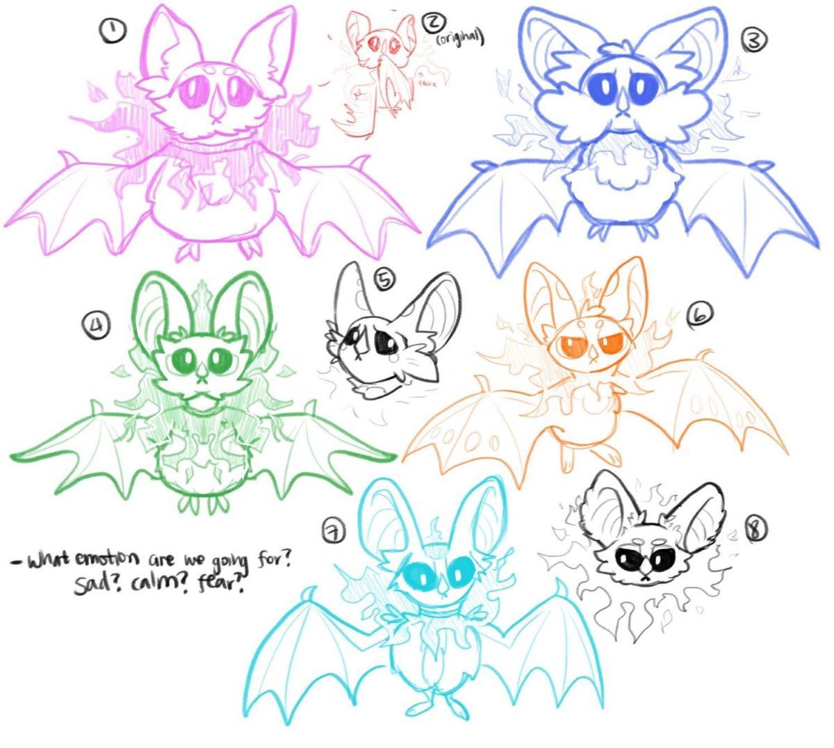
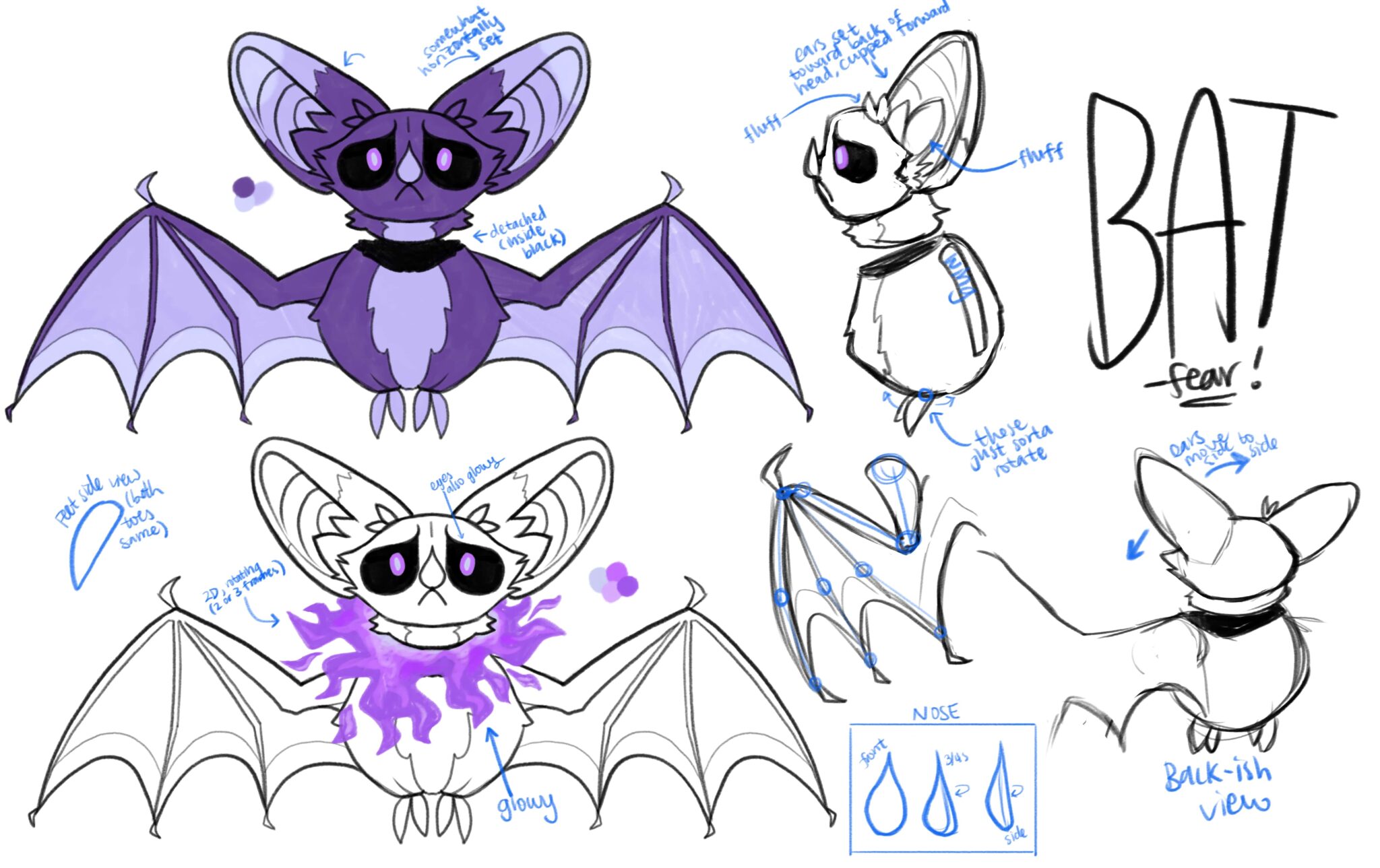
The Fear starter was the second Phantom to be finalized, after our little Joy friend (you can read about the Joy starter here)! I actually drew this Phantom up before we’d decided on what emotions we were going to use as types in the game, so its expressions originally weren’t entirely fearful πŸ˜…

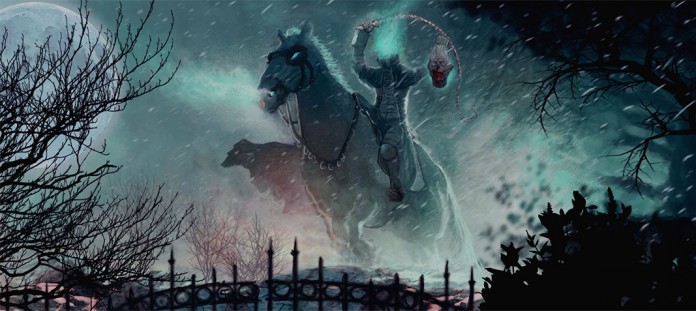
My idea from the start had been based on another mythological creature: the Dullahan! The Dullahan is a mythological headless horseman (sometimes horsewoman!) from Ireland. They’re pretty dang spooky sounding! They carry a whip made from a human spine, has a hideous grin and rotting flesh, and typically carries their own head under their arm! They are also somewhat commonly portrayed with a ghostly flame coming from the stump where their head once sat πŸ‘»

Scary! But our little Fear friend isn’t quite so intimidating. However, they do take a few similarities from the Dullahan. For one, their head is, indeed, detached. Around the stump is a ring of ghostly purple flames (to be animated… soon πŸ‘€). It would have been easy to make a bat-like creature draw from vampire mythos, but I like to make things hard for myself πŸ™ƒ

In Conclusion

Thanks for reading! These creatures and myths have been really fun to research! Congratulations for reading this far, and I hope you have an awesome day πŸ˜€

Anger Starter

What’s up, everyone? Time has been chugging along over here, and it’s finally spring! I can now go on walks and still feel my face when I get home! 🌸

So! In this post I’m going to be talking about my personal favorite starter — Anger! If you’d like to read more about the general process and philosophy behind all of these starter designs, check out my last devblog post here! And without further ado…

Anger Starter 😠

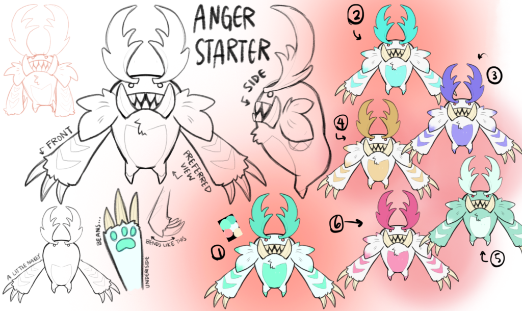
Though I personally love this Phantom, during our initial tests with people, a lot of folks were put off by how scary-looking the original design was so I had to dial it back a little bit… πŸ˜…

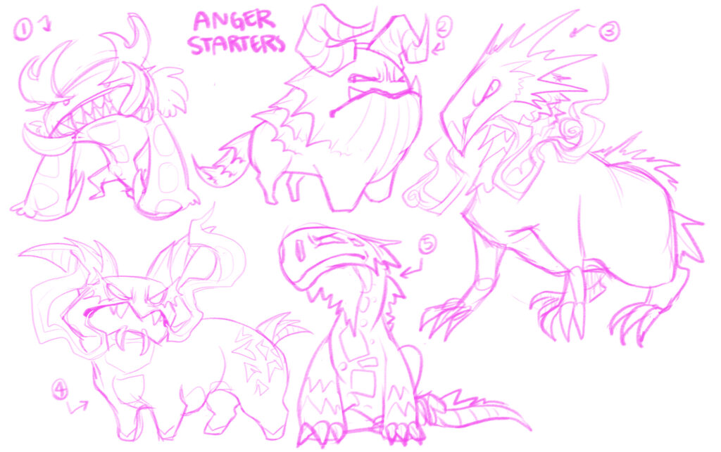
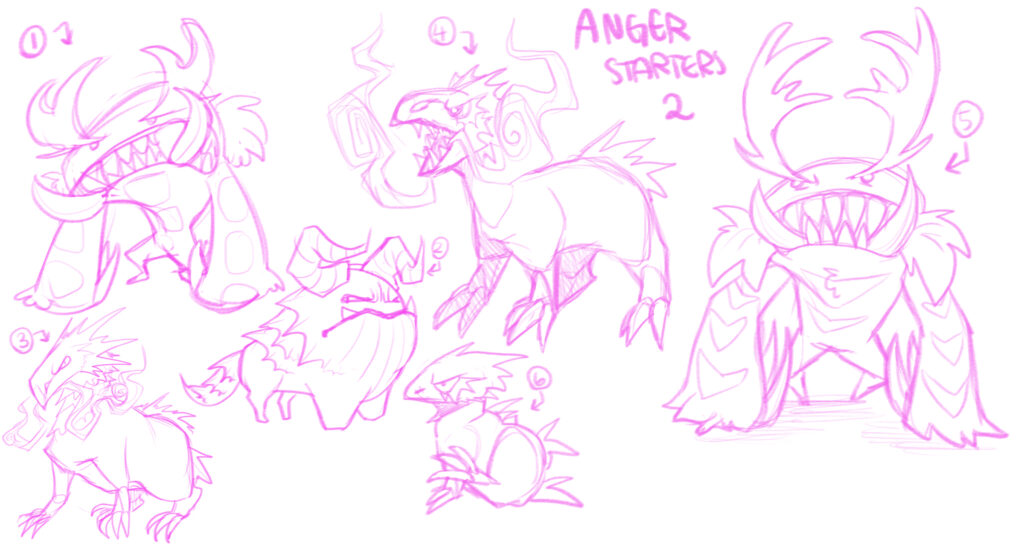
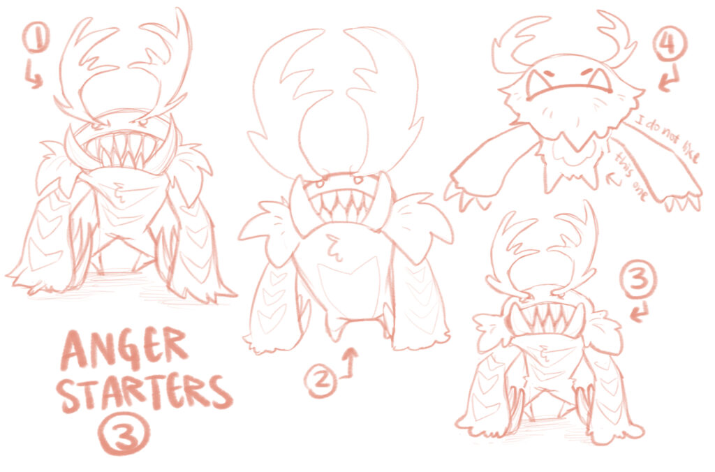
Like most of the other Phantoms so far, we have to go through a few different iterations to get to where we are, but the original design vomit sheet was pretty diverse!

Reminder: a lot of the designs that weren’t chosen might show up later as Phantoms! Just not as starters πŸ‘ And the “final” design that we chose is even still subject to change!

When thinking of anger as an emotion, most people link it with the element of πŸ”₯ fire πŸ”₯, and I wanted to curb that expectation of typings in The Phantom Keeper. Games like Pokemon, Final Fantasy, and other RPGs use a lot of elemental types but our game is meant to be different, using emotions instead! Not all of the Anger Phantoms will be fiery, not all of the Sadness Phantoms will be water-based, etc! And what better place to start than a starter!

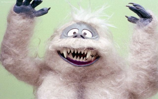
The inspiration behind the Anger starter was pretty simple: the yeti, Abominable Snowman, or Meh-Teh! I was looking for a cryptid, monster, or animal that could look intimidating, but still be somewhat… fluffy? So here we are! Big ol arms, tiny little legs, big angry eyebrow/horns, and somewhat cartoonishly scary claws!

And the Abominable Snowman is…? A polar bear | Las Vegas Review-Journal

The Yeti is purported to live in the Himalayan mountain range, and is described somewhat similarly to Bigfoot / Sasquatch and other ape-like cryptids. There have been numerous reported sightings of Yetis, starting with pre-Buddhist Himalayan people supposedly worshipping this “wild man” who was depicted as an ape-like creature. These people also shared tales of the Yeti to warn people away from dangerous animals, and to stay close to the community (similar to countless other cultures!).

During the 20th century, more Westerners began climbing the Himalayas and describing huge footprints on the mountain (many of these were later thought to be bear tracks). Like most cryptids, a majority of the “evidence” of the Yeti’s existence comes from eye witness reports. However! There are a few pieces of physical evidence — almost all of which has been disproven 😬 A scalp found by Sir Edmund Hillary (the first man to scale Mt Everest!) in 1960 (later determined to be from a serow, an animal similar to a goat), some mysterious footprints (later determined to be bear tracks), and even a finger were reported to be proof of the Yeti! (The finger was later found to be human through DNA analysis, possibly from a monk’s corpse… yikes.) Various hair, teeth, and tissue samples thought to belong to Yetis have also been tested against the DNA of known species. Most of these have been found to be from animals such as cows, bears, horses, and dogs.

Ending Notes!

So yeah! I only went through one Phantom this time around, but I really like talking about cryptozoology soooo πŸ˜…

I hope you enjoyed reading, and if you have any questions or comments, please let me know either by commenting below ⬇️ or by hopping on the Pine Drake discord server! I promise I don’t bite, but I cannot say the same for our lil Anger starter (gottem, tied it back, nice)! Thanks for reading! πŸ‘‹

Joy / Sadness Starters

How’s it goin’, gamers?! It’s Sera, back at it again with some fresh new concept art content! πŸŽ‰πŸŽ‰πŸŽ‰

In this blog post, I’m going to be writing about some of the starter Phantoms and what inspired their designs! You can read more about what exactly these starter Phantoms are in Claire’s previous post and maybe a bit more about individuals in the future, but here I’m going to be discussing specifically their appearances: what we were going for, and how we got there!

Phantom Design?πŸ€”

For starters specifically, we pushed very hard for Phantoms to be cute, likeable, and immediately recognizable. So! Things that tend to make creatures likeable and baby are using a lot of rounded shapes, biggish eyes, and by making them small! To make things immediately recognizable, we strove for unique silhouettes (dang, I almost spelled it right the first time), and differing colors from one another.

For future, non-starter Phantoms, we’ll also have more non-baby creatures, and I’ll get to flex a little more on some creepy/cool stuff πŸ’ͺ😈.

Joy Starter 😁

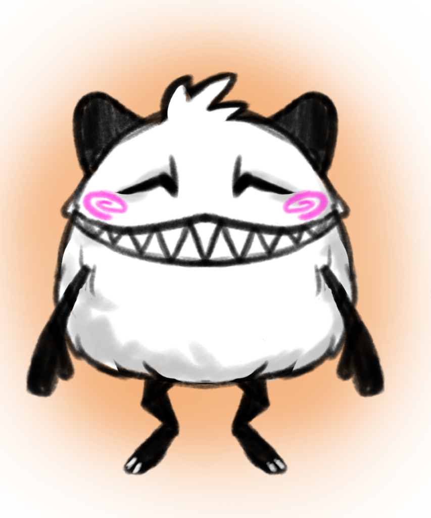
The first Phantom we revealed (and the first one with a finalized design)! Remember this promo image I did?

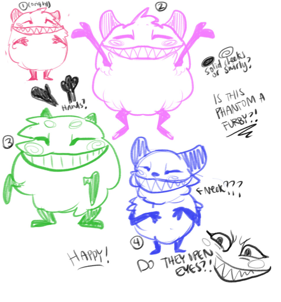
There they are! The design is simple, but we felt it would make a likeable and cute starter for people to bond with. Their design pretty much hasn’t changed from the original giant sheet of phantom concepts that I sketched up (maybe to be revealed in the future, it has a lot of possible spoilers).

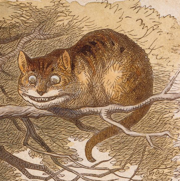
The Joy starter was mostly based on the pretty well-known character from Alice in Wonderland, the Cheshire Cat! The Cheshire Cat had always been my favorite character in the story, and I thought that devious energy would synergize well with happiness and make it a bit more interesting. Fun Fact: did you know that Lewis Carrol possibly got the inspiration for the Cheshire Cat from a creepy stone carving of a grinning cat? Neat!

That, and BIG GREMLIN ENERGY is always at the top of my priorities list. We added knees during the transition from the very first design to the final one specifically to maximize bastard energy 😈

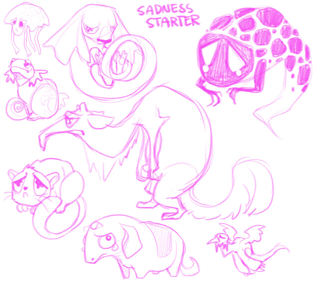
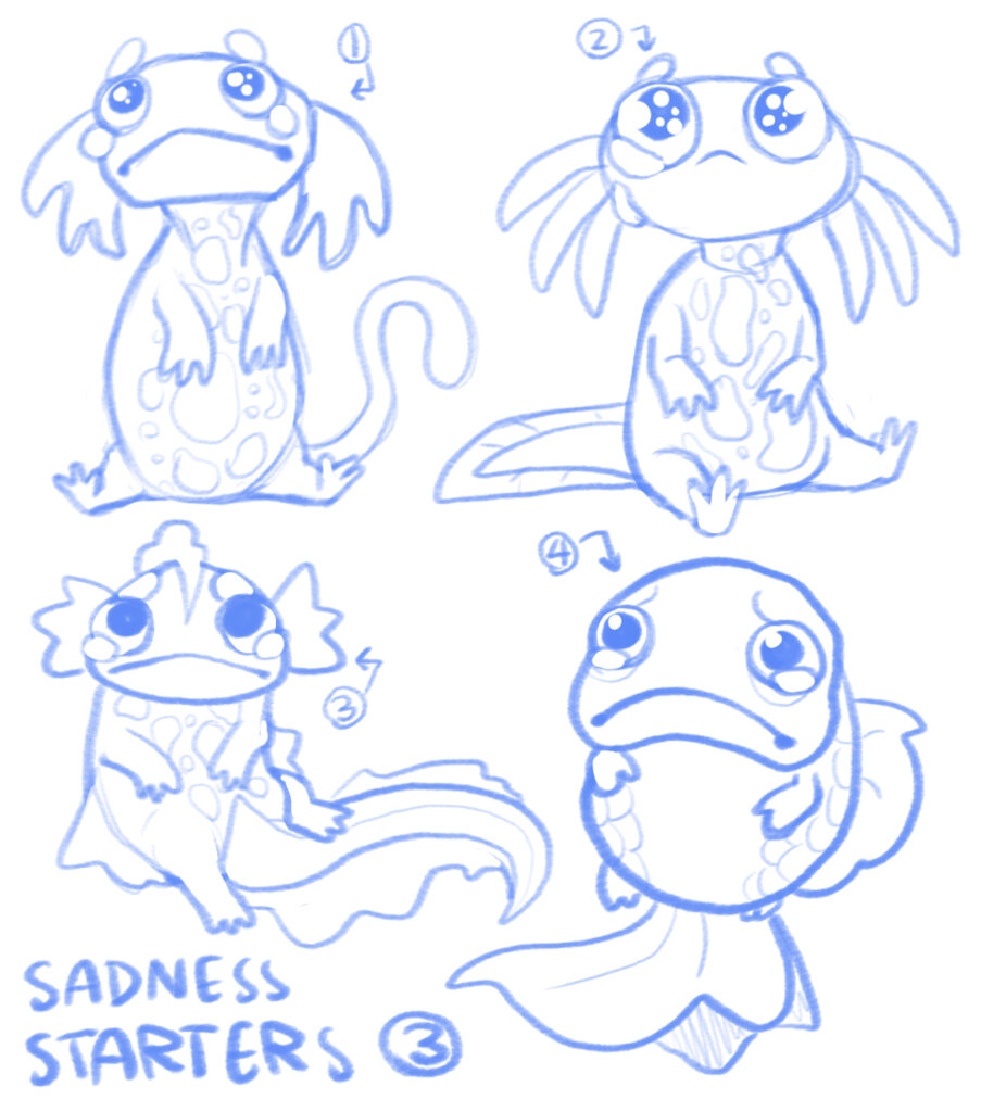
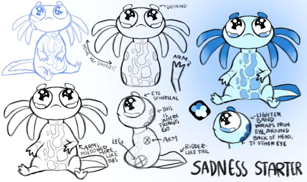
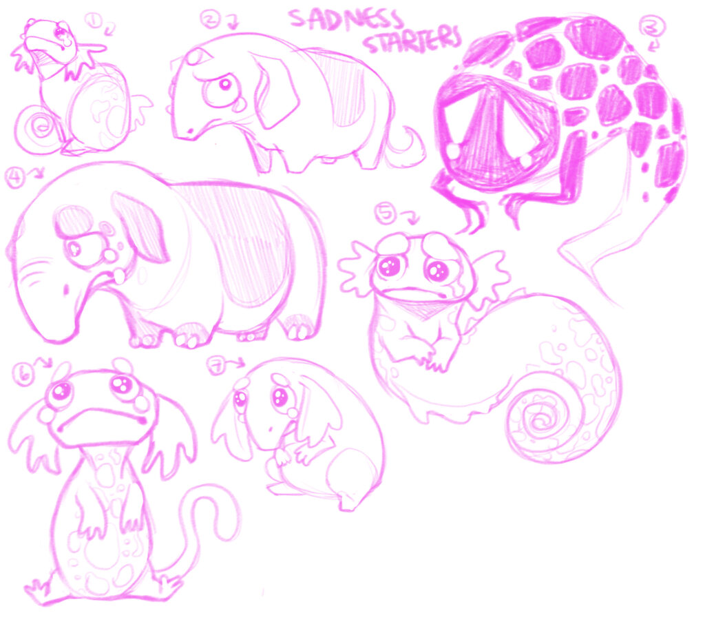
Sadness Starter 😒

The sadness starter went through… a few iterations before we got to a final design. And even now, colors might change! Who knows 🀷

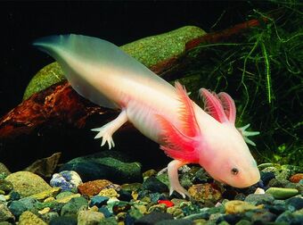
I had a few very different ideas for this starter, but the one we ended up with is very much based on axolotls! If you didn’t know, axolotls are amphibians, more specifically neotenic salamanders. Neoteny means that the animals undergo sexual maturation without undergoing metamorphosis!

Axolotls make excellent laboratory subjects due to their regenerative abilities, and are widespread in the pet trade due to how easily they breed in captivity! They are also only native to Lake Xochmilco and Lake Chalco in Mexico, and are currently on the International Union for Conservation of Nature’s threatened species list πŸ˜”. Unfortunately, conservation efforts are somewhat difficult, due to pollution of their natural environments and the introduction of predatory fish which feed on young axolotls.

Ending Notes!

So yeah! Sorry to end on that somewhat somber note 😟 There are still 5 other starters to go through, and most of those have a little more ~folklore~ than these ones did! I hope you enjoyed this regardless, and thank you very much for reading! πŸ‘‹

Sera OUT

Sera Tiem + Player Character!

πŸ‘‹ Hiya! I’m Sera, the 2D artist at Pine Drake Games! I did all of the character portraits, concept art, and some of the UI in Apotheker, and I’m now working on concept art for The Phantom Keeper! I also do character commissions (mostly DnD)!

❗ There’s going to be a lot of exclamation points (and emojis) in this, just warning you. ❗

Anyways! In these posts I’m going to be chatting about the environment, creature, and character concept art going into The Phantom Keeper! So I figured I would start off with the first character you see in the game–yourself!

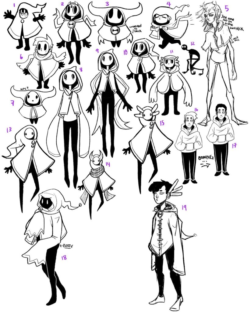
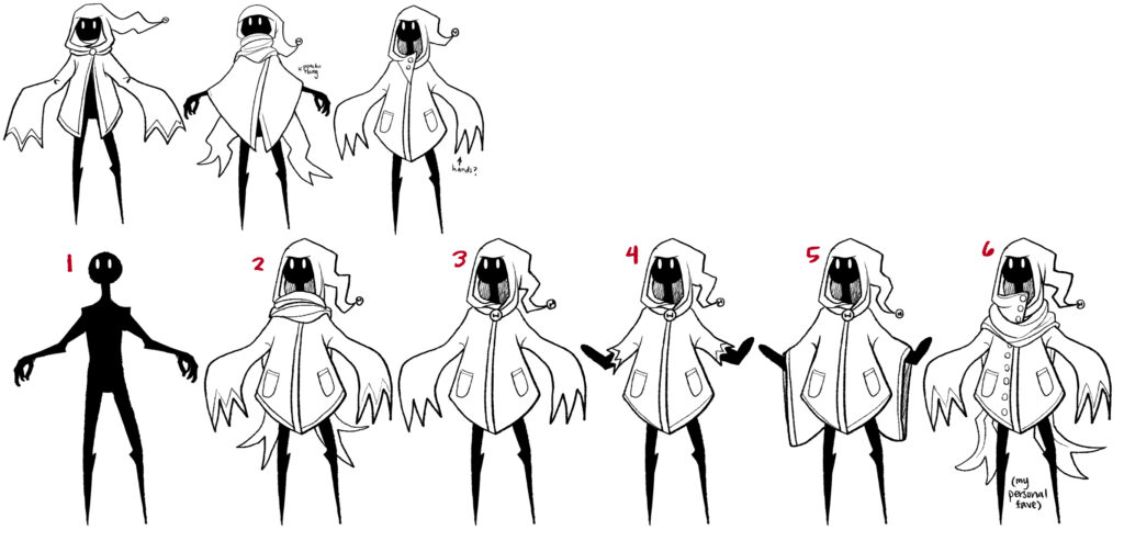
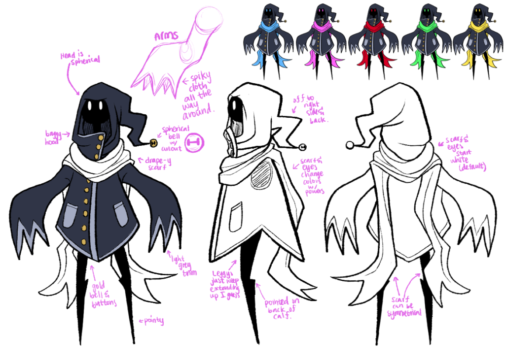
The player character was the first concept we wanted to nail down, since the rest of the game’s look could kind of be generated around their aesthetic. We wanted them to be gender neutral, and be the blank slate sort of character that players could identify with (huge inspirations were Journey and Hollow Knight). It was also important for us to aim for a somewhat neutral color palette that would work well with the different colored auras of the phantoms (more on that in a later post, probably). So! Other than that, there wasn’t actually a lot of direction regarding the PC. ❓ Were they tall? Short? Skinny? Round? ❓ Who knows! So I made a huge sheet of potential places to start:

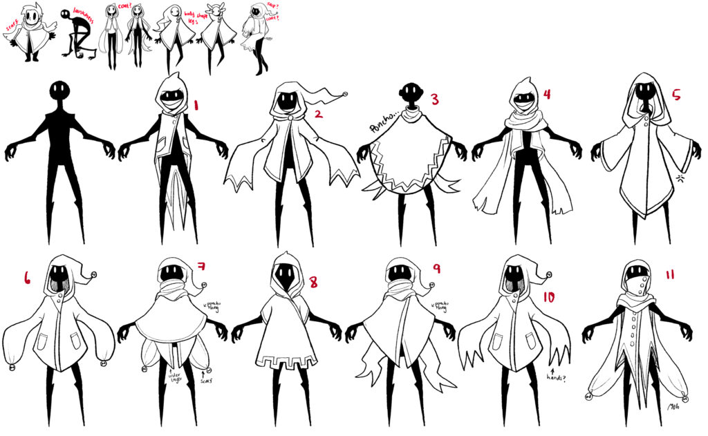
From here, we decided that we liked (if I recall correctly, it’s been a bit) 8, 9, 12, 13, and 18 out of this set. So I kept going with a few more rounds until we came to our final design:

Things we were looking for in terms of shape:

  • Legs somewhat free to move (so animation wasn’t terrible) 🦡
    • This ended up being accomplished by having a sorta stiff, triangular-profiled coat
  • Long, flowy bits that would make them visually interesting 🧣
    • This ended up being the hood, sleeves, and scarf
  • Androgynous kinda body (which, lemme just say, any body can be androgynous? But we wanted something that people wouldn’t immediately interpret as either feminine or masculine. Just wanted to clear that up real quick) πŸ‘€
    • Mostly covered, and fairly angular / stylized limbs and face!

So yeah! That was pretty much the process behind the player character and how their design came about! Our concept art process might not be what every studio does, but it works for our tiny team. I like just throwing out a bunch of ideas, and then going through them with everyone, choosing what works and what doesn’t from each design before moving forward with another round of designs based on that feedback. I do miss the axolotl masks from the very first round though… maybe they’ll come back with an NPC later πŸ‘€

Thanks for reading (esp if you made it this far??? Wow???)! In the future, I’ll be talking more about the creature designs, which should be loads of fun! They’re pretty much all based on cryptids, monsters from folklore, literature, or mythology, so that should be a blast πŸ˜€

Bye!