Hello world! It’s ya girl, Sera, back at it again in the devblog! …anyways.
Today’s post is about the final 2 starters that I haven’t talked about yet: shame and calm! Now! I didn’t leave these ones till the end for any reason in particular, so don’t get your hopes up too high 😅 But I do think these designs came out pretty rad, and I hope everyone else does too!
Shame Starter 😷
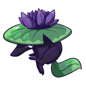
Now this one was, surprisingly, a big favorite among people who playtested our Phantom starter quiz a while back! I didn’t expect Shame to be such a hit (my favorite is still Anger!), but a lot of people really like them for some reason!
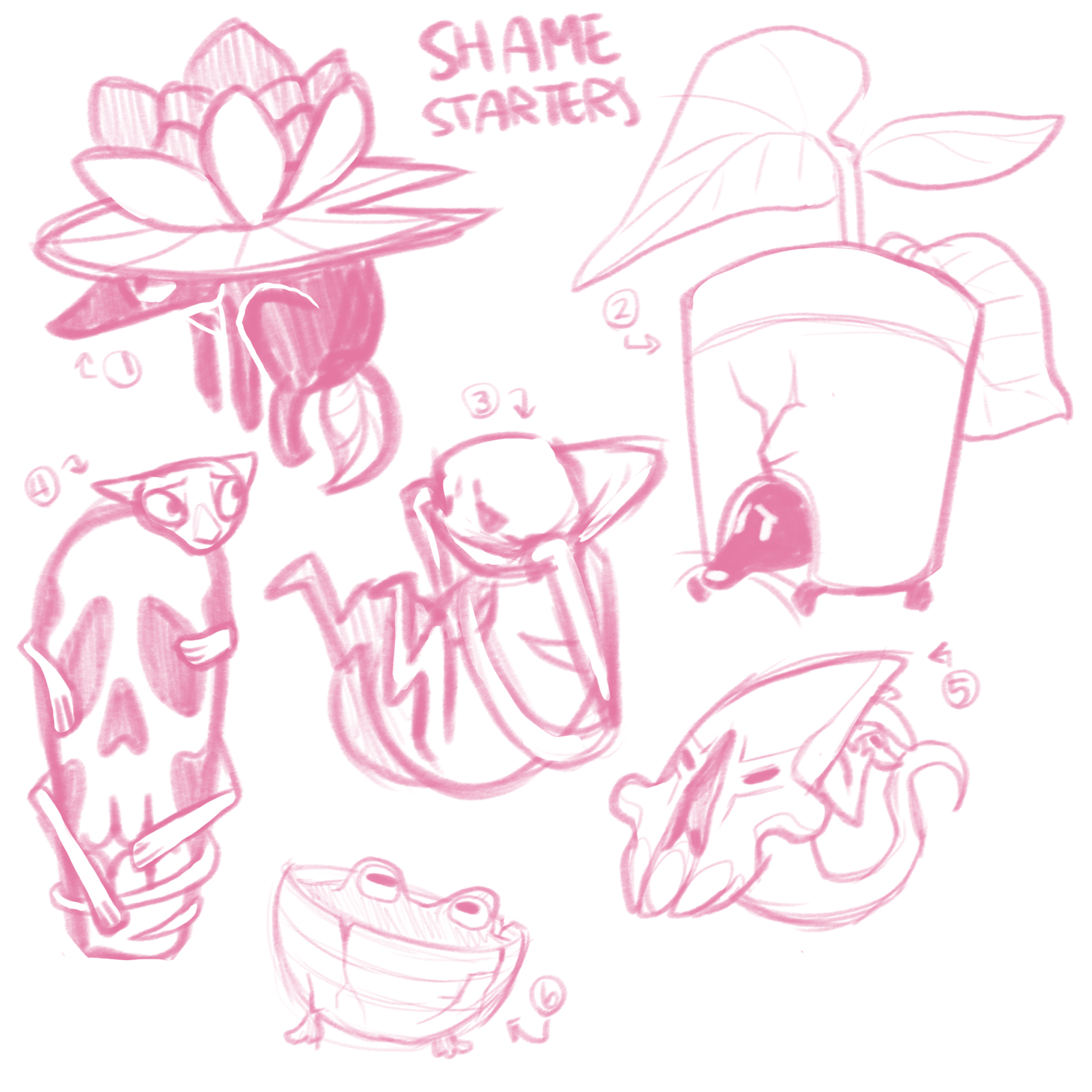
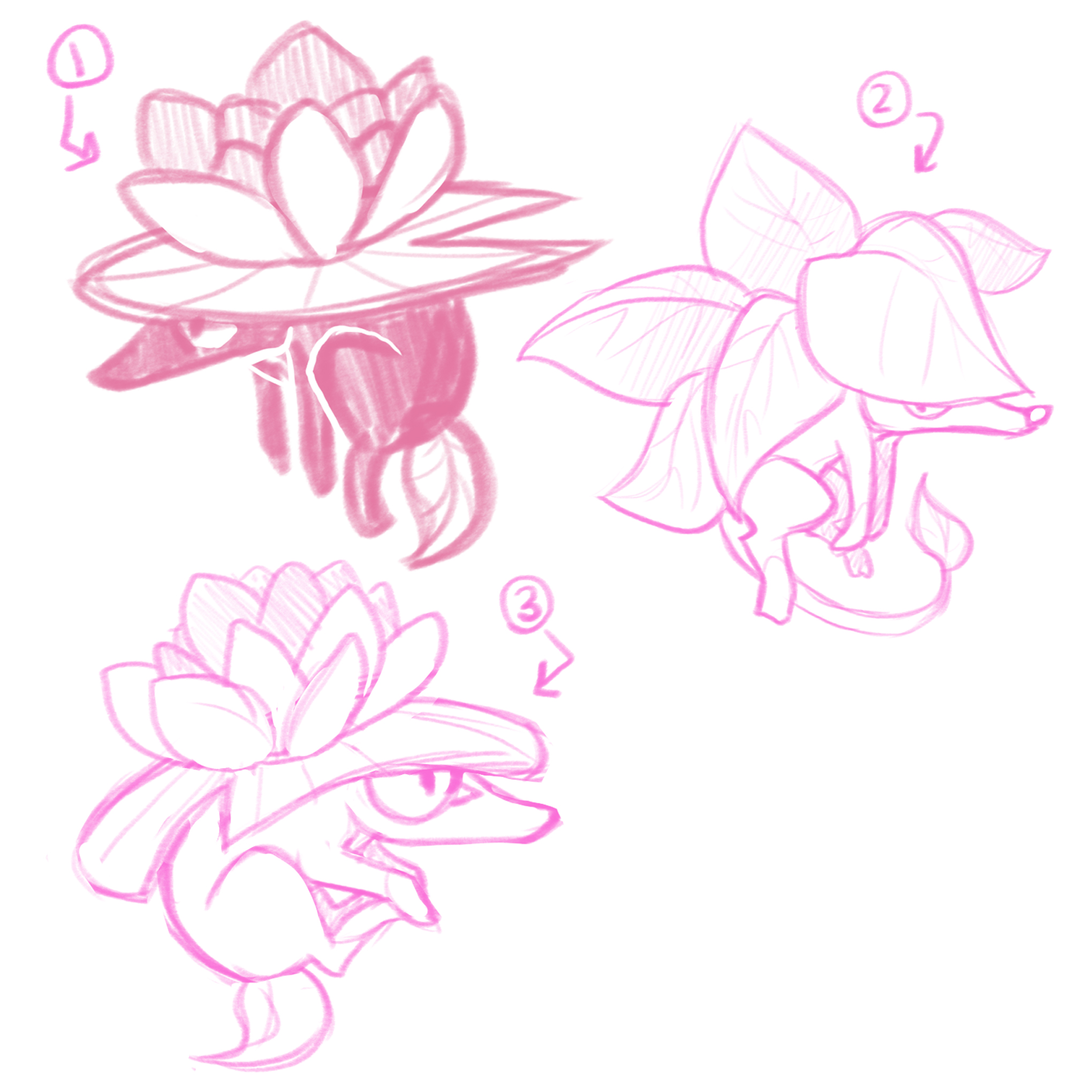
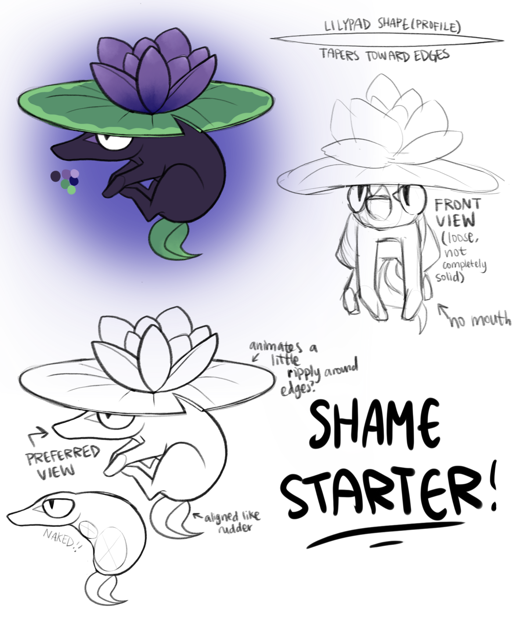
Their design process was rather short, with the final design being pretty much the same as one in the first round of rough sketches!
The idea of designing something around the concept of shame is a weird one, and a lot of my ideas revolved around the actual creature hiding either in or behind something. The one we ended up going with is probably the least extreme use of that idea, just sorta chilling underneath a lilypad. The Shame starter is extremely loosely based on a Japanese yokai, the kappa! Very loosely. Pretty much the only thing they have in common is a tendency to hide underwater and some kind of plant-y camouflage on their heads! I’ll probably make another Phantom more based on kappas so I can talk about them some other time 🙂
The Shame starter ended up much more shrew-like than anything, and I think people ended up liking them because they’re just a bit sassier than a lot of the other starters!
Calm Starter 😌
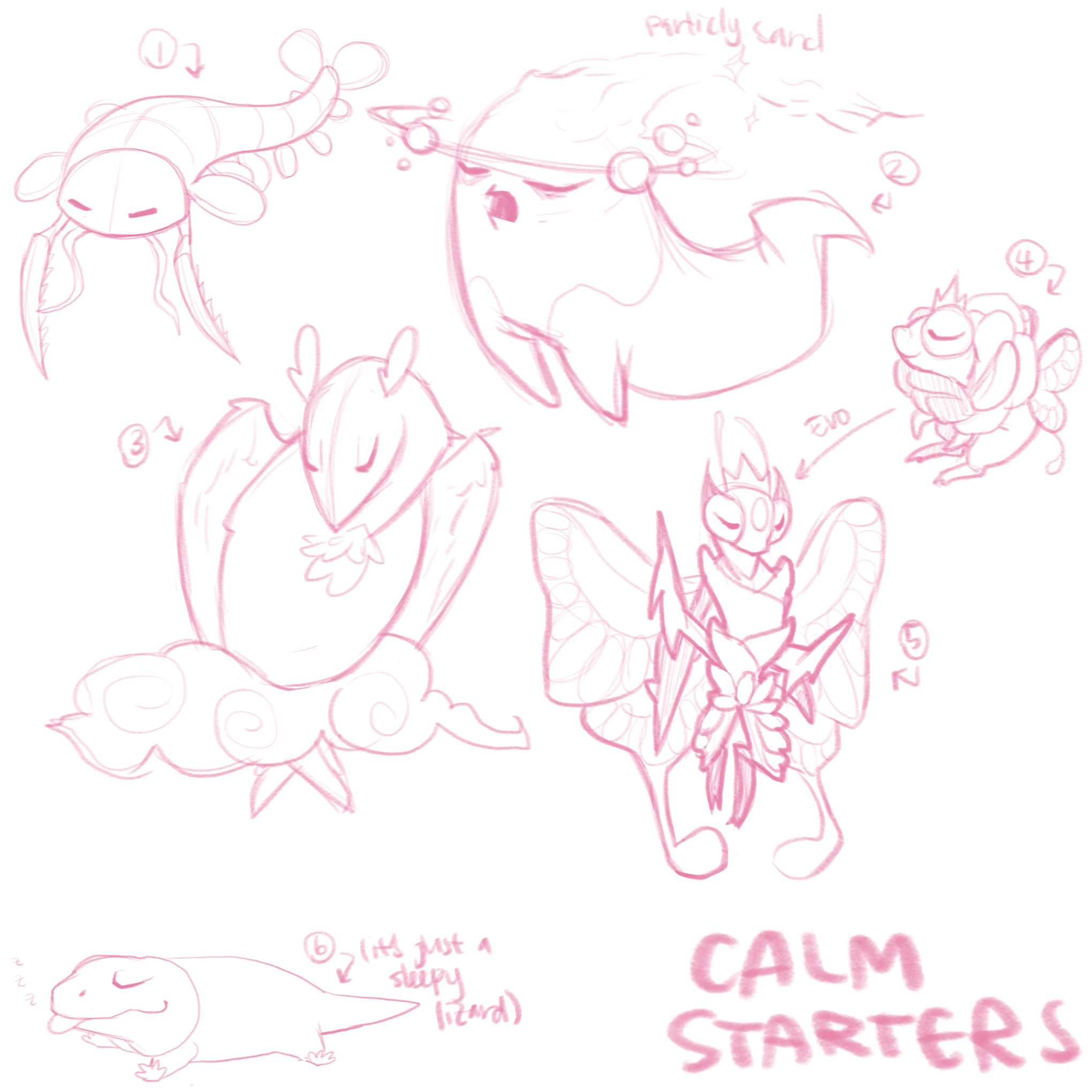
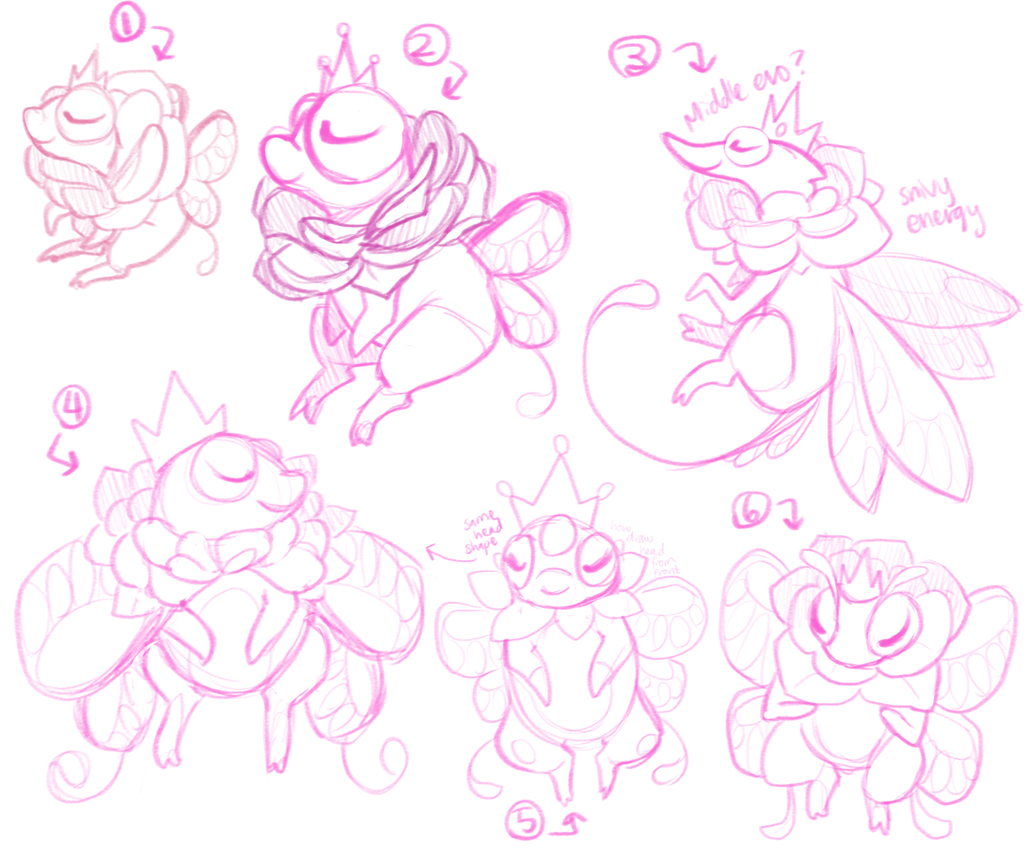
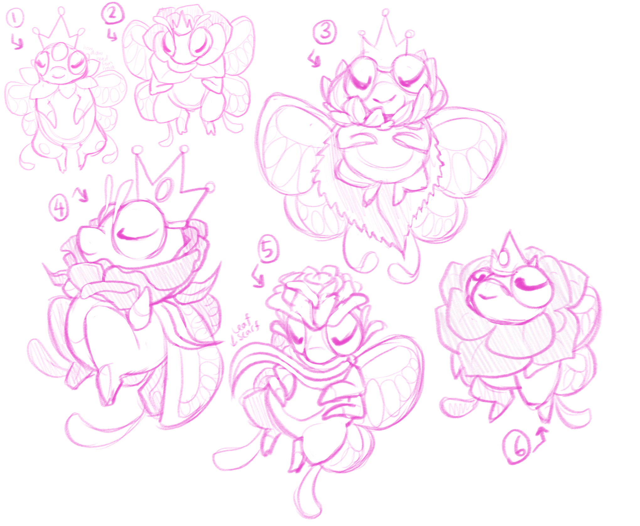
The Calm starter! They had to go through a lot of adjustment to get some proportions exactly how we wanted, but ended but fairly close to one of the first designs (that seems to be a trend 🤔).
The first idea I went to when thinking about “Calm” as a principle emotion for a character to have was to make them sleepy! But other than that… I didn’t have a lot of ideas for shapes, or much inspiration for somewhere to start! One of the Phantoms in the first round (number 2) is based on Sandman, and I still really like the design! But it felt a little too on the nose looking like a ghost for a starter.
So! The idea we ended up going with is based on fae in general, but a bit more on the ones in A Midsummer Night’s Dream, solely based on the idea of royalty and a fae court. A lot of people seemed to think this Phantom was kinda froggish, but my intention was to make them more bug-like… 😓 I see where the confusion comes from, though.
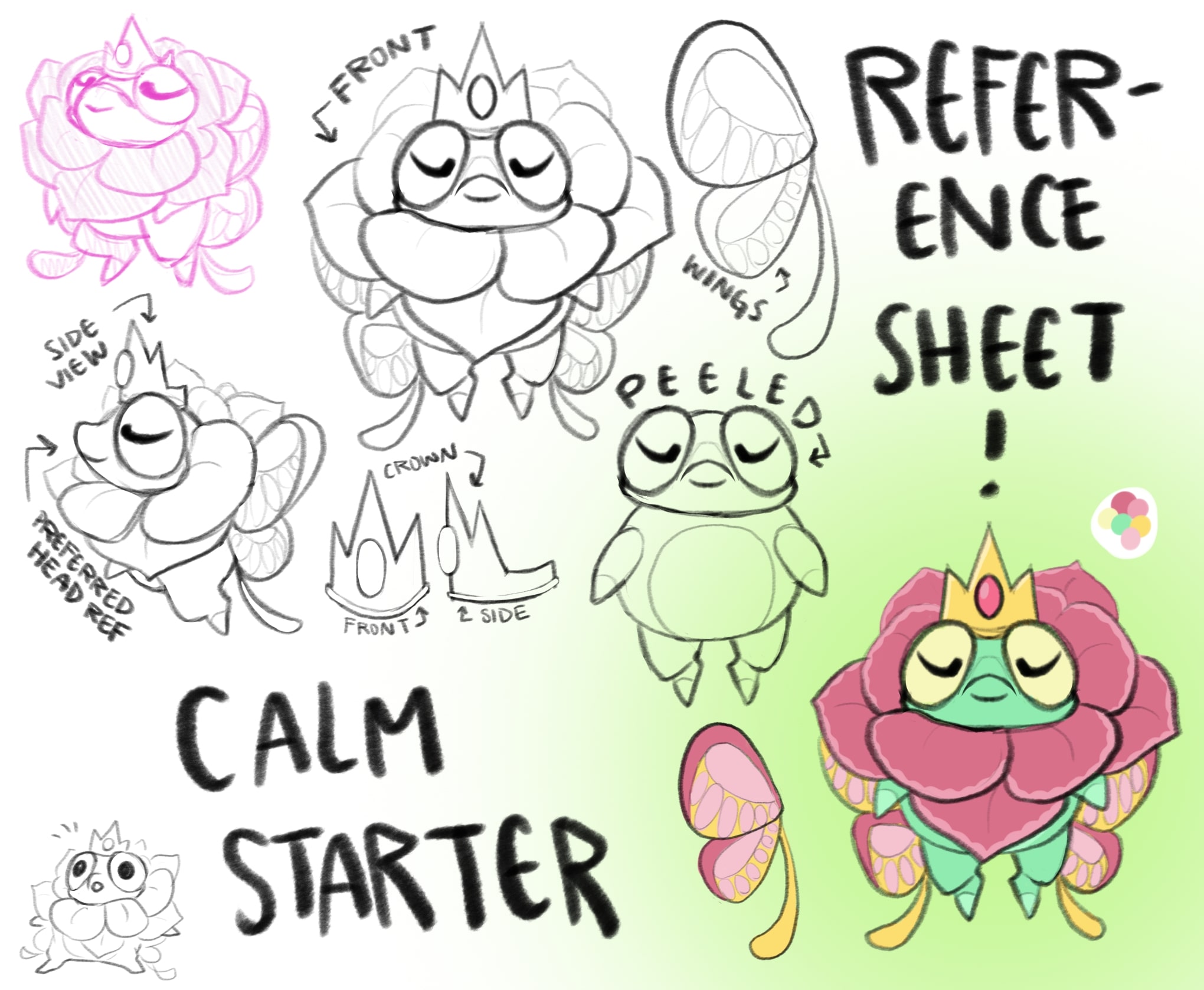
So! Flowers, royalty, bugginess, butterflies, that’s a lot of ideas to pack into one design! I think we did a decent job, but they do end up being the most complicated-looking Phantom! I think that’s ok 🙂 One of the notes we got from playtesters was that this Phantom gave them a smug vibe, which was unintentional, but I like it 😈 I’m always extremely down to make Phantoms that aren’t all sunshine and rainbows!
You may have also noticed that some of the my reference sheets include a sketch labeled either “peeled” or “naked”… That’s not just me being weird! It’s so Claire has a better reference when she starts modeling the Phantom 😅
Conclusion
Soo, yeah! That wraps up all of the starter Phantoms! I still have plenty more to talk about, though! I’ve done more NPCs, environments, and Phantoms so I still have loads to rant about! Thanks for sticking with me and reading my blog posts! I really do appreciate it, and I enjoy writing these! If you have any questions at all, please feel free to either comment or join our Discord!
Oh! And you probably already know this if you’ve been reading Claire and CJ’s own posts, but we’ve been working on some business stuff, and I did a few cleaned up little drawings of our starters for that, so I’ll leave off with those! 👋


